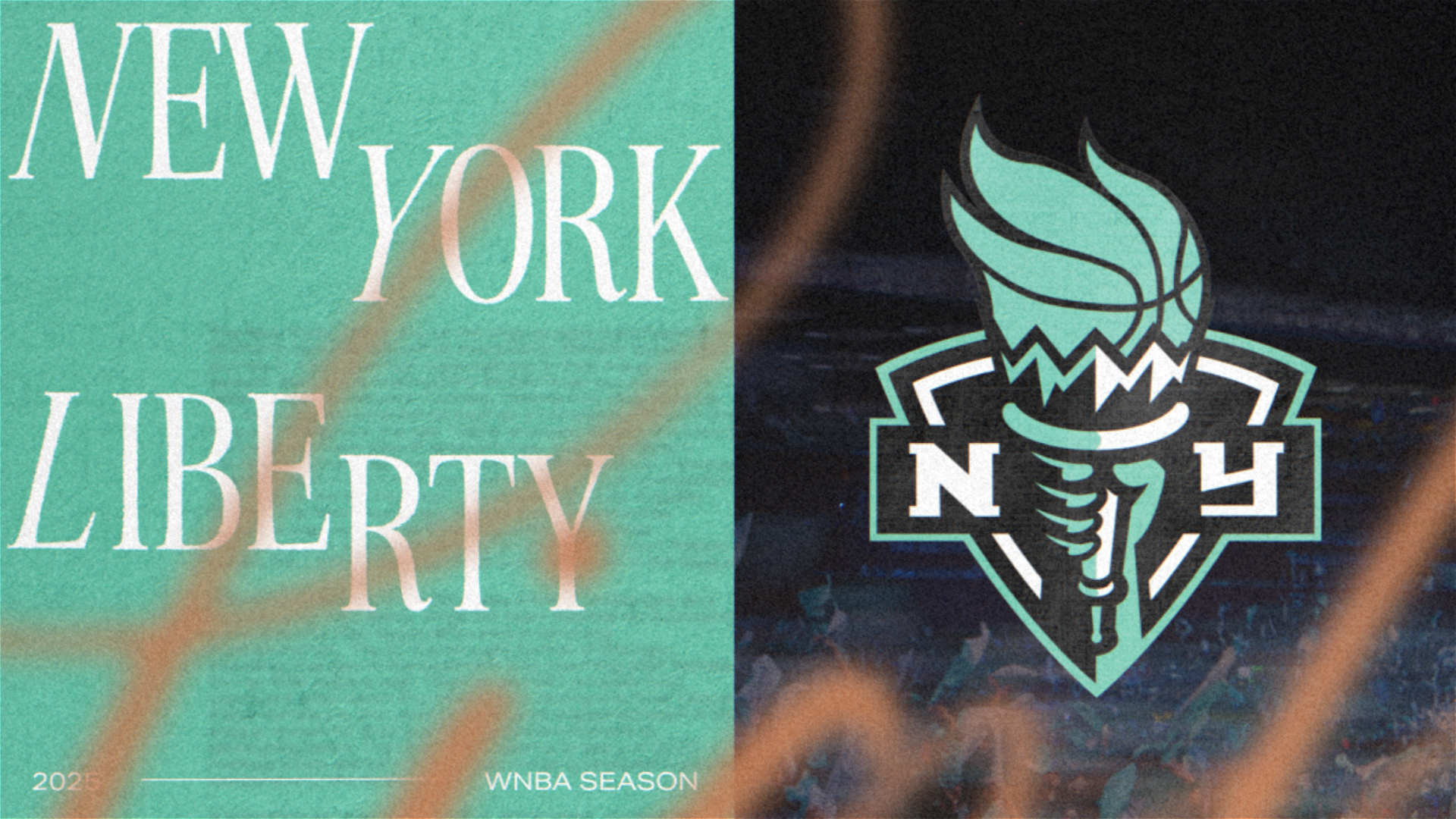
New York Liberty
Stadium GFX | Ae Template GFX
The New York Liberty called on us to craft a GFX package that matched their fearless identity: unapologetically bold, relentlessly stylish. Drawing from the city’s raw energy, we layered in striking photography, sharp typographic moments, and expressive light leaks to create a look that’s equal parts power and polish. The result is a refined package that is uniquely New York.
Double Click videos to view fullscreen
Logo Loop - Venue Mockup
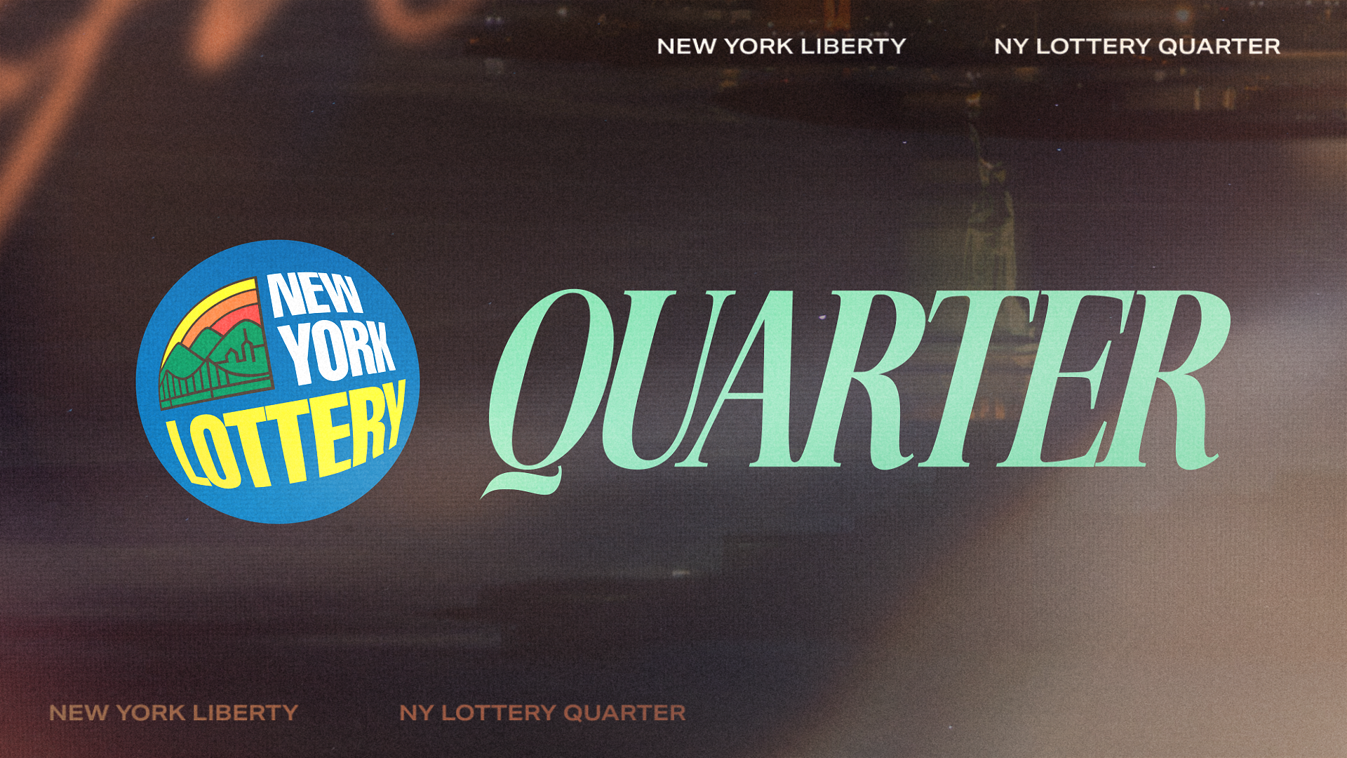
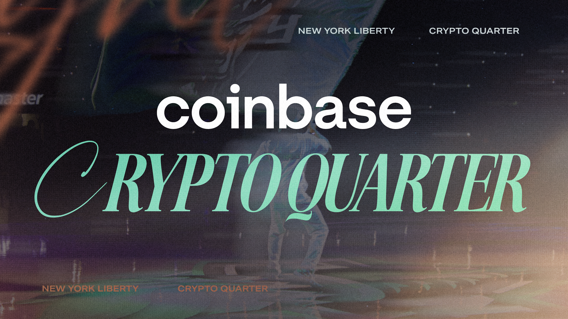
Various Prompts throughout Barclays Center
Upcoming - All Screens
22 Matchup & Upcoming full-takeovers resulted in over 1000 rendered video deliverables all with home and opponent team name, location, game dates, times, and sponsor slots. In addition, we created custom visual variations based on if it was a day time or night time game to let the visuals of New York further inform the fans.
PlayerID Lineup - All Screens
The Liberty's star-studded 12-woman roster resulted in 120 rendered PlayerID video deliverables for starting lineups.
Each takeover includes the player's name, number, position, school and three slots for video footage to let their personalities shine. As with the entire build, it was delivered in the requested naming convention to ensure a smooth game operation file exchange.
Action Prompts
To quickly spotlight key player performances throughout the game, we created an additional set of arena takeover assets for all players on the roster as well as general takeovers for “Three” and “And-1” plays.
Three - Main Board
PlayerID Action - All Screens
Utilizing 3D text animations we variety of noise prompts for the Liberty to use throughout their season. Each prompt had two variations along with a toggleable sponsor slot. It also featured a background image option for creating even more variety in the future.
Noise Prompts
Defense
Let’s Go Liberty
Get Loud
Design Quilt:

Design Process Snapshot
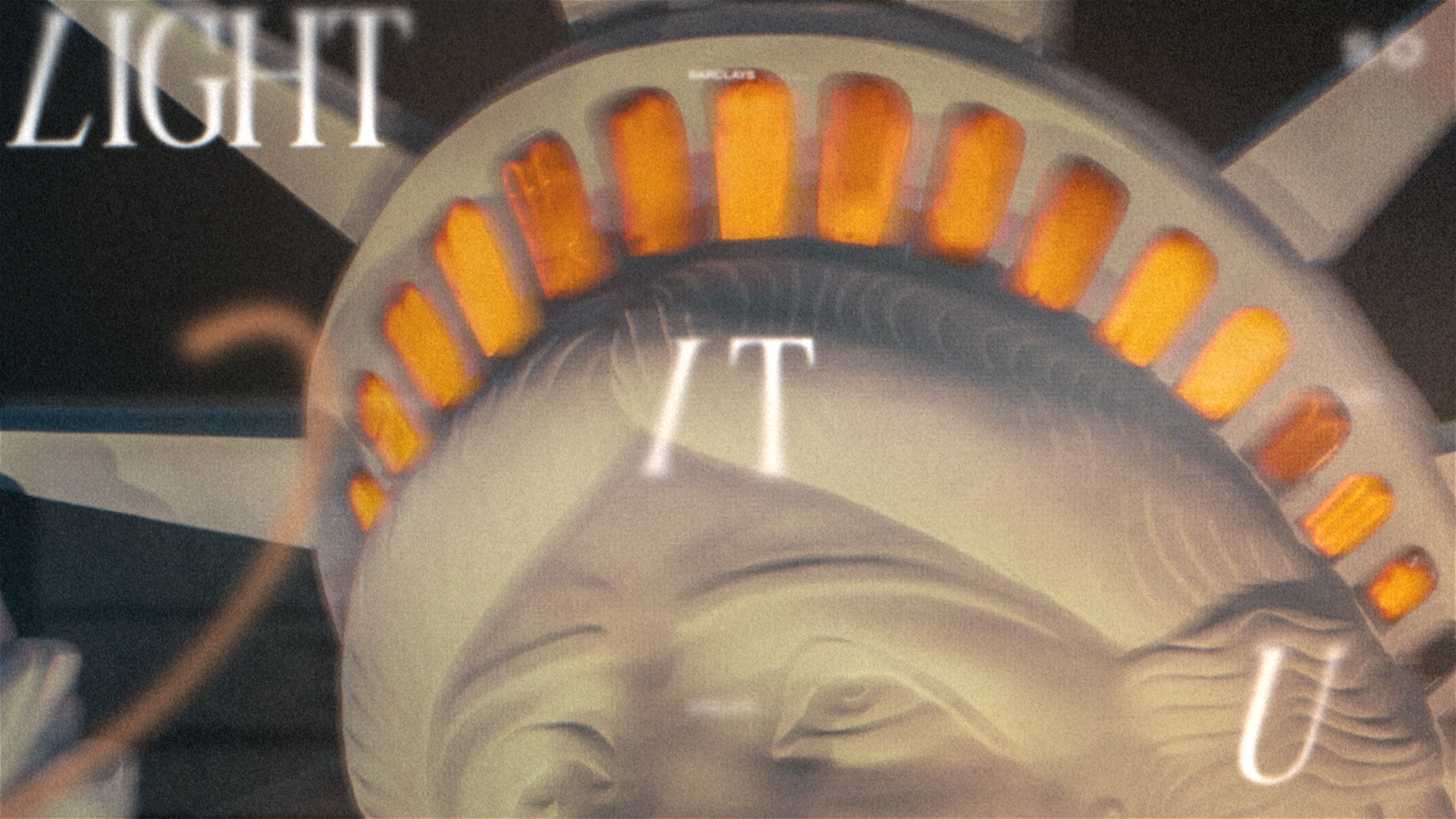
Here is a snapshot of us early in our design exploration phase. At the beginning of each project we like to hop into Illustrator and stress-test all their typography and brand elements based on our initial conversations and design brief. It was fun to get to experiment with more editorial compositions and get creative with the elegant and refined typography. With their brand direction being actively developed as we started the package, we took a collaborative approach to help propose new visual looks while also refining the design as their “Light It Up” campaign direction solidified.

Still Frames for detail: